Working on your own stuff is hard. And it doesn’t get much easier the more you do it. My theory is that, just like looking into the mirror and seeing how other people see you, it’s very difficult to make something that reflects who you are as a person/company/organization while also appealing to who you need to appeal to. You want to appear a certain way but is that the same way that will vibe with your customers?
Is there any possibility to get the theme of joshcanhelp.com? I fell in love with that site
– Nice dude trying to buy my theme
This is the 5th iteration of my site and I wanted it to last for a long while. While I really love to tinker and build fun things, spending too much time on my own stuff feels a bit … selfish? Navel-gazing? Boring? So I came up with a few high points for what I wanted to accomplish with the site to keep my itchy dev fingers in check:
- Attention to detail around responsiveness. In-browser responsive work is one of my strengths and I wanted that to be obvious. I’m also a really heavy mobile web browser and it’s just not that hard to get it right.
- Make it dead-simple to publish posts and new work. The best thing this site has ever done is cause someone to email me saying “you sound like someone I want to work with.” Because the working relationship – client/vendor or team/member – is the most important thing, it’s important for someone to see my recent posts, see what I’ve been doing lately, and make a quick judgement whether I’m a good fit for their project.
- Just look nice. I’m not technically a designer but my aesthetic sense, if we share one, is important because not every little tiny thing needs to be designed. I can translate a plan or a style guide into a site that looks great and that needs to show.
- Get the messaging right. I think I did a pretty good job overall. I sent it to a number of folks that I’ve worked with in the past, ones that I would always work for again, and the feedback was very positive.
Beyond that, everything else was a nice-to-have.
So, I started with my ever-evolving starter theme and went to work blocking out how I wanted everything to look and function. Here’s a few things I think I did right:
- There is a distinct desktop, tablet, and mobile layout. 3-columns, 2-columns, then 1 column. This made breaking down rows, like the ones on the homepage or the comments section on posts, very easy to think about. I’m using Bourbon and Neat for a really simple grid and a few other SCSS utilities.
- The light gray and blue throughout the site is taken straight from iMessage. I’m not excellent at picking out colors but I can really appreciate when they’re done correctly. The gray Apple used is warm and the blue, if you’re an iPhone user, makes you feel good because you’re interfacing with the same type of device. I’m not a hardcore Apple guy or anything, I just appreciate the UI details and think it lends a subtle sense of familiarity for some.
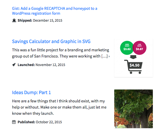
- I’m using post formats for the posts, major work pieces, and minor work pieces. This has made it really easy to come up with simple, re-usable listing templates that give a little extra information for each type.

Because completely redesigning your site and re-writing all the sales copy isn’t a big enough job, I also decided to correct pretty much every other issue I could find. This site was built in WordPress for the first time in 2008 and I’ve changed the link and category structure at least twice as many times as I’ve rebuilt the site. So all kinds of things needed attention:
- Fixed hundreds of broken internal and external links (thank god for the very capable Broken Link Checker plugin, still took a day or two of work)
- Cleaned up piles of old redirects (walked through all of them, kept a few key ones, and dumped the rest)
- Broken images and images loading from a random folder on my host (scripted a move from linked post content to the Media library)
- Walked through each post to makes sure there wasn’t any layout issues
- Cleaned up the comments
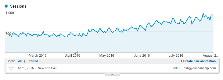
While this was definitely more of an OCD exercise than a directed task to improve site usability, it turned out that it made a huge difference in traffic to the site, almost double:

What’s next? Well, let me consult my overly-ambitious Trello list of internal projects:
- Enter literally every relevant web project I’ve ever done since starting almost a decade ago.
- Write and post 6 detailed work write-ups for recent projects (5 once I hit publish on this one)
- Add technology tags with a filter on my work section; make that all AJAX-y
- Switch commenting to be on-page without reloading (considering React for this since I’m moving in that direction but probably overkill unless I’m using it everywhere else)
- Finish the 4 posts that have been sitting as drafts for a while
- Turn the ideas page into a React-powered votable list using Airtable (amazing piece of software)
I’ll just knock all that out this weekend.
< Take Action >
Comment via:
Subscribe via:
< Read More >
Tags
Newer

Jun 11, 2016
Community and eCommerce Site for Massive Minecraft Community
8-month engagement to provide engineering, strategy, code review, pair programming, performance reviews, and security guidance.
Older

Apr 01, 2016
Latest Deals Site Built on Rank It WP
A WordPress child theme gone mad! Built-in click statistics, moderation controls, grabbing text and images from submitted links, and expiring content.