👋 I'm curently looking for a new role. Hire me!
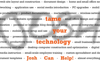
Sharing the front face of my next business card:

For anyone following, this is my second iteration and definitely the one most closely related to what I’m actually doing.
The last business card I had made was mostly a product of me being completely enthralled with cartoonist and blogger extraordinaire, Hugh MacLeod of gapingvoid fame. I found his cartoons a few years ago and really enjoyed their honesty. Hugh made the great move of making his cartoons available as business cards through a site called StreetCards.com. Through a link on his site, you logged into StreetCards, picked an appropriate (or inappropriate) card, added your information, gave them the 16 digits, and waited for a shipment from the UK. I had nothing to promote besides my blog (a different one than this which didn’t even have ads on it at the time) but I felt like I needed an easy way to network and meet people.
Well, now it’s April 2008 and I need business cards… for a good reason. I wouldn’t say this whole JoshCanHelp thing is blowing up per say but I definitely have found myself in a couple situations where having a small piece of card stock would be handy. Designing a card has been on my to-do list for a few months but I always had it in my mind that I would learn the digital layout software Quark first and then submit a design to a local printer. Not only is the Quark thing on hold for the moment (I’m trying to pick an enormous, expensive software program to use and Quark isn’t winning) but I could definitely benefit from having something, ANYTHING, right now. So I drew up a few designs, settled the one I liked, set my free, simple drawing program to high resolution, and went to work.
The first thing I came up with is this:

If you can’t tell, the black text is the same font as my website (Trebuchet MS) and the red text is Rockwell (a font I would have never chosen until I saw it used properly). I really liked how it turned out so I showed it to a few people. The main complaint was that the important message – tame your technology – was difficult to discern and should be larger. I also heard (and thought myself) that the red text should be larger than the rest.
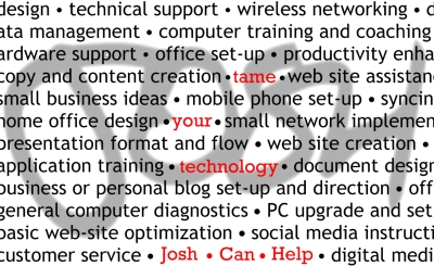
Since I had made the original design as a plain image, I had to start over with the new design. This was actually a blessing in disguise because, instead of repairing what went wrong, I just rebuilt everything to the correct specs. I used Rockwell font for all the front text but dropped the descriptions down a bit. Instead of cutting letters and words off (intentionally), I continued the words on the next line (to add continuity) to make the most out of the space. For the “josh” in the background, I lightened it quite a bit and added a blur effect to take the concentration off of my name. Finally, I left the separators between the attributes as dashes instead of manually changing them to black dots (individually).
I’ll say this: it is difficult to come up with a design and a message that accurately conveys your sense of creativity and vigor and excitement while also concentrating on being somewhat original. I’ve seen some amazing business cards on-line and it seems insane to even try and compete with half of them. But, in the end, that’s simply not the point. Just like my resume is no comparison to other resumes out there, my business card is not at all a matter of out-doing other people out there. If I don’t make an impression in person, it’s unlikely that my card is going to open some magical door.
Layer-by-layer, inch-by-inch. The message is more effective as a snowball, building momentum and speed and power and influence over time, than as one massive onslaught. A better presence is made by just that: presence.
Your comments are welcome and highly desired. Thank you.
< Take Action >
Comment via:
Subscribe via:
< Read More >
Tags
Newer

Apr 15, 2008
Free Excel Invoice Template
I just recently made an invoice for myself and thought I would share it with the world! It’s clean, simple, and easy to use.
Older

Apr 09, 2008
Problem Solved #00001 - DSL, Wifi, printers
This customer called me to help him move his router, make sure wi-fi worked throughout the house, set up a printer with Vista (which was causing him problems), and possibly help him acquire a new desktop.