👋 I'm curently looking for a new role. Hire me!
I think data can solve most problems. Think about it… if you had all the right information and you trusted that information and you were able to get past your emotional response, you would always make significantly better decisions. This is a pretty vague, overarching statement but I believe it can be applied everywhere. Whether or not you’re half-robot, like myself, there’s one thing you can’t deny: data can help you answer some questions with surprising accuracy. The question today is, did I shoot myself in the foot by redesigning one of my pages. The answer: definitely.

I just read “The Lean Startup” by Eric Ries and enjoyed it a lot, more than I expected to in fact. I’ll save the pontification about this “Lean” concept for another time but the main thing I got from the book surrounded collecting and using actionable information to learn about your customers and make decisions about changes and improvements. I wrote about this kind of iteration before, it’s something that drives everything I do and, before this book, I never knew there was a name for it.
But I digress. The point is that there are so many ways to gather information about what you’re doing, both online and off, that the excuses for not acquiring and using this data are getting increasingly lame. Take, for instance, Google Analytics (GA). There is a wealth of data in there, as well as a wealth of what Ries would call “vanity metrics.” You can easily dazzle yourself with the numbers and assume that the pretty blue lines going up and to the right are doing you a favor. Many times, you’re just fooling yourself. Here’s how.
Redesign it and they will come
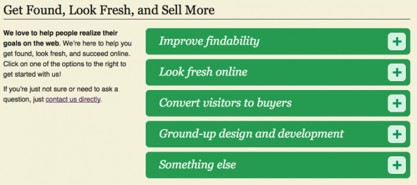
I’ve been making web long enough to know that a site redesign is probably a mistake half the time. Often, a better use of time, effort, and money is to refresh important pages for search engine optimization (SEO) and conversions (are people doing something after they read that page). I’ve taken this to heart on my own site, mostly because it’s the right move but partially because a redesign is time-consuming. In that vein, I redesigned my “Get Help” page back in July.

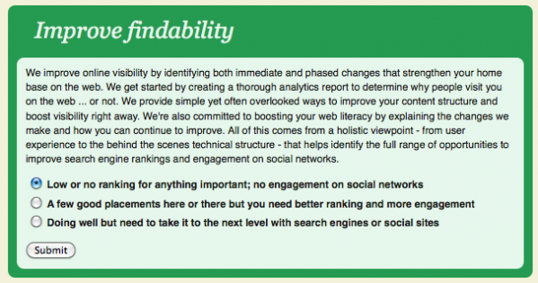
This page had always been a bit of a catch-all and had some of the oldest perennial content on my whole site. I spent some time focusing my message with a great communication planner, Therese Beale, and I was ready for it to see the light of day. My idea was that I would outline what I have to offer (the first 4 things above) simply and give people a chance to buy in to the process before they even contact me by selecting an option to get started. I would get more information and they would be ready to take that next step:
 I built the page, changed the link, redirected the old page, announced it on Facebook and called it a day. That was 3 months ago.
Time to check the analytics
I was thinking about conversions for another site the other day and it occurred to me that I never went back to look how that page was working. I felt like I was getting less contacts in general but didn’t have any numbers to back it up so I dove into GA for the numbers I needed.
Now, here’s where you need to be specific about what you’re trying to do. This is a page I want people to see before they hire me. The next page I want them to see is the contact page and that’s where I’m sending them with the form above. Compared to the old page, I want to know:
- Where did they go after they were on this page?
- How did they interact with this page while they were here?
What I don’t care about for this analysis is:
- How many people saw this page?
- How did they get to this page?
This page exists to convince people to move forward. Sure, I want more people on this page but the specific aspects of the redesign don’t contribute to that. How many people saw this page is a vanity metric, it doesn’t help me learn anything. In this case, it went up but traffic on the site as a whole went up as well so that’s not helpful. In fact, there are a number of different things we can count, measure, and analyze that won’t help us decide whether this redesign was a success or not.
In this case, I determined that this redesign was not a success. It was a bit disheartening to see that but it’s much better to learn something than to avoid disappointment. Here’s how I arrived at this conclusion.
Very helpful numbers
Again, to restate our goal, we want to know how people interacted with this page once they got here and what they did next. The below is a list of metrics that helped me determine that. The bold indicates the metric name and the square brackets is the navigation you use to get to that point in GA. Also, when I say “old,” I mean the page before redesign, “new” is after, both span approximately 3 months. To get the same, just follow the navigation path and get that metric for the both the old and the new time spans.
- Exits [Contact > Top Content > enter the page path in Filter Page at the bottom > “% Exit” column]: An exit is where someone left your site altogether from that page. On this page, exits are bad because I don’t have any external links I want people to go to. The old was 15% and the new was 30%. The percentage of people leaving my site after seeing this page doubled. Not so good.
- Time on page [same as above > “Avg. Time on Page” column]: This number is the time, on average, people spent looking at this page. For the most part, I’d like this to go up since you can’t get through everything in a short period of time. The new page was an average of 1 minute, 28 seconds and the new was 54 seconds. This metric should be going up but it’s going down. Again, not great.
- Bounce Rate [same as above > “Bounce Rate” column]: A “bounce” is where someone came to that page and left before seeing any other page. This kind of behavior is common with incoming search engine traffic. People either get what they need and take off (say, a helpful blog post) or don’t see what they want and bail (say, an unhelpful content page). For a page like this, we want this number to go down. The old page bounced people 50% of the time and the new 58% of the time. Not a huge difference but, once again, not what we’re looking for.
Exits went up, time on page went down, and bounce rate went up. It’s clear that this page is not doing what it should be. Still, let’s look at a few more numbers to be sure.
Somewhat helpful numbers
The metrics here are either secondary in importance to the ones above or just didn’t tell us much of anything.
- Number of people who ended up on the contact page [Contact > Top Content > enter the page path in Filter Page at the bottom > click on the Contact page > click the “Content Detail” drop down and select “Navigation Summary” > look for your redesigned page in the “Previous Pages” column on the left]: Since the contact page is the last step of the funnel before people can convert, we want people on this page more than any other. With both the old page and the new one, 6% of the views for the contact page came from the Help page. The problem is that the traffic on the Help page increased 38% overall (total site traffic also increased) so this didn’t give me much actionable information.
- Number of people ending up on other important pages [Contact > Top Content > find the page in question and click on its path > click the “Content Detail” drop down and select “Navigation Summary” > look for other important pages on the right]: So let’s say someone came to this Get Help page, read what I offer and thought “I’m not quite ready to take the plunge.” If they move on to another important page on the site, like my About page or my Portfolio, I’ll consider that a positive move. Comparing old to new, 30% went to another “funnel” page on both designs so nothing to glean from that.
Using the 5 metrics above, the helpful ones and the somewhat helpful ones, you can determine whether your page change was a success or not. In my case, everything either got worse or stayed the same so I’m going to go with no, not a success. I’ll talk about what I think needs to change in a moment but let’s briefly look at unhelpful numbers here.
Unhelpful numbers
At best, these metrics are ones that make us feel better (“vanity” metrics), at the worst we can use them to deceive ourselves and others into thinking something good has happened. Here are numbers that don’t help us here.
- Pageviews or visitors: The number of people seeing this page has nothing to do with how the page is performing. You might have changed a few keywords around or improved your search engine structure but that’s not going to tell us whether this page does the job or not.
- Number of contacts: I vacillated on this one. I counted the number of contacts that came in total and then compared that to the number of people who saw the Get Help page. In the end, the two can’t be connected in any real way since contacts could come from anywhere.
- Unique versus returning visitors: While it might be good to know if people need to come back once or twice in order to take the next step, there’s not much I can do to get accurate information from the numbers I have. Maybe someone saw it before the redesign and then after and that changed their perspective.
So, we know how to judge the page, now what do we do about this poor performer?
Take a guess, then take action
Here’s what I think is happening:
- This nice, clean page doesn’t have any clear paths forward. The green bars look nice but I don’t know if everyone is understanding what to do when they see them
- Once those are open, I think there is too much content and I don’t think it matches the tone of the rest of the site.
- The form radio buttons, the ones that took a while to put together, would work better as links. Why click twice when you can click once?
I’m going to break all the sections out and leave them on-page with links to take the next step. Rest assured I’ll be running this same analysis when I’m complete! If you have any questions or comments about my methods above, feel free to ask my in the comments section below.
< Take Action >
Comment via:
Subscribe via:
< Read More >
Tags
Newer
Older

Oct 18, 2011
Great Content Is Like a Produce Stand in Paris
You're just another blog out there but with a little creativity and some care for the people coming through, you can be just what someone needs at just the right time.