Graffiti art evolution: from drawing to painting to vector; moving your art into a new market
👋 I'm curently looking for a new role. Hire me!
I like finding two things that don’t intuitively mix and extend them out until they touch. It might seem funny to a graffiti writer think that the tools of logo/icon design (vector illustration software like Adobe Illustrator) could help them achieve new things and reach new people. To me, a computer nerd first, a businessman next, and a graffiti artist on the side, the whole process makes perfect sense.
This kind of thinking can work for any kind of artist. If you paint pictures, you can design shirts. If you draw cartoons, you can easily translate that to digital images for web sites or blogs. Find the niche, spread the word, and extent your influence. The more people you can reach with your art, the better (from a sales and reputation standpoint). If you do your art on the west coast and have build a following, there will be people on the east coast who have never heard of you and would probably love your work.
Here’s what I’m talking about…
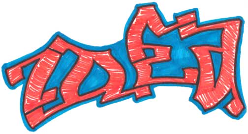
I started with a simple drawing in my sketchbook. First step was pencil, then just plain old Sharpie marker on top. I don’t pretend to be an accomplished artist by any means but you get the idea. At this point, it was time to put some paint down so it was off the the Art Academy of San Diego.
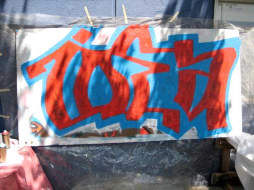
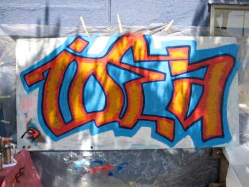
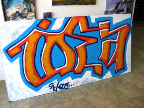
Overall, this is definitely the best piece that I’ve done. It’s also the third time I’ve ever put can to wall and really went at one of my drawings. This art form is very cathartic for me… more on that another time.
The second picture above is almost where I stopped but I decided to add the white shine on the top and sides which really set the piece off. I really wanted a black outline but I bought Rustoleum satin black and that just is not the right paint for an outline so I ended up falling back to my old faithful, “blue note” by Montana Gold.
This could be the stopping point for an artist but, in my mind, there is more to do… much more.
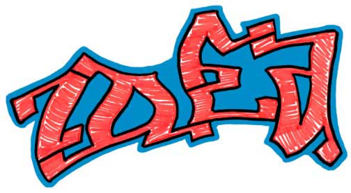
With just ink on paper, there isn’t much that can be done with it but, as you can see here, I scanned the image into my computer (with my handy-dandy Canon MP610 printer/scanner which I highly recommend). Now, in Adobe Photoshop, I start playing with the image to make it look more vibrant and consistent. First, (this is always first for me) I opened the Image > Adjustment > Levels window. For those unfamiliar with Photoshop, this affects how much white and black is in the image; it’s like a contrast adjustment on crack. Just play with the levels until it looks right. Next adjustment was Image > Adjustment > Saturation. I use this to bring out the colors and make it look a bit more like my drawing (scanned images seem to lose a lot of color). Finally, to make the colors (black, light blue, and orange) perfectly consistent, I used the Eyedropper tool (“I“), picked a color the represented the color the best, then picked the Paint Bucket tool (“G“). At the top, I set the tolerance to “60,” found a spot on the color I sampled, then dumped it. Because the contrast is so high between these colors, it worked out perfectly. Then, using the same color, I picked the Brush tool (“B“), chose an appropriate size (“[” to decrease and “]” to increase), and cleaned everything up. I did this for each color.
This image is “finished,” meaning that this drawing has gone about as far as it can. To move forward and make something transferrable, we need to move it into a new program, Adobe Illustrator.
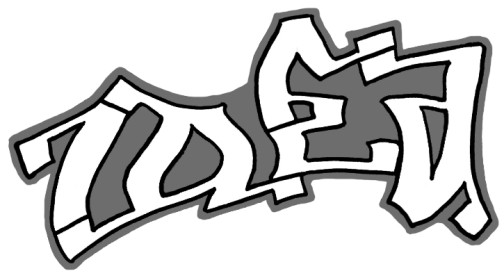
First, in Photoshop, I took all the color out by going to Image > Adjustment > Desaturate. I’m not going to transfer the scribbles in the middle nor am I going to keep the color, just the outline of the letters themselves and the outline of the background.
Now I select the image, copy it, and paste it into Illustrator. The next part is a pain in the butt (especially if you’re a novice like me).
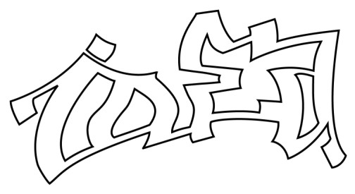
I keep the black and white image from Photoshop and use it to trace. What we’re doing when we trace a pixel image (image from Photoshop) is creating a line path on top of the illustration. Because this awesome programs work with image layers, we’re not changing the original image (though it looks like we are). Image layers are the digital equivalent of clear transparencies. If you can imagine tracing a picture with pens on a transparency and you have an idea of these layers. The fun part about these is that the layers are basically infinite so minor changes can be made and altered a million different ways.
To make this outline, I took the Pen tool (“P“) and added an anchor point on each corner, following the outline of the letters. See how you can follow that line around the entire piece except for the dot on the “i” and the insides of the letters? Every continous line is its own path and will be traced separately and then combined.
I would love to write out a tutorial about how this is done but it’s a bit beyond the scope of this post. If you’re dying to know, here it is in a nutshell:
- The path around the edge of each letters is 4 point with no fill (simple techniques you can learn on-line).
- After creating the path with the Pen tool, it was really blocky with straight lines only. Correcting this was the tricky part. Hold down Shift, then press “C” to use the Convert Anchor Point tool. Click on the point that connects on of the lines you want to be curved, hold down the mouse button, and drag away from the point to make handles appear. If this doesn’t seem to work, zoom in and make sure you’re selecting the point. the two lines that connect to this point will likely be screwed up now. Click on the square end of one of the handles and drag it around the point to separate it from the other handle. You’ve now made a “combination anchor point.” Now, type “A” on the keyboard and screw with the handles until the line curves correctly. You’ll have to do this for all the lines you want curved. This is a pain in the butt, not intuitive at first, and takes practice.
- The insides of the letters (4 paths… see that?) were subtracted from the outside by selecting all 5 paths (hold down Shift while clicking), then choosing Window > Pathfinder, clicking on the “Subtract from shape area,” then clicking Expand (both are in the Pathfinder window on the left).
After all of that, I finally had an outline. Why all of this work? This image can now be resized to any size, large of small, without losing quality. You can also do some awesome things with this but first…
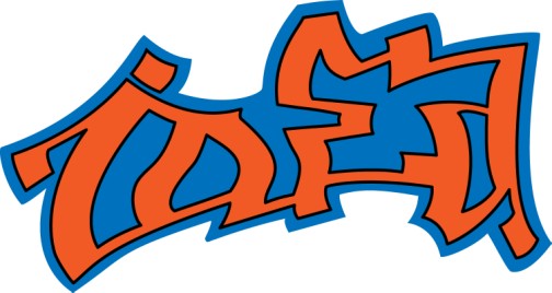
….I added the original colors to show how clean this format is. Picking new colors is as easy as selecting the shape and finding a new color in Illustrator’s swatches. I was really excited to find some amazing combinations of colors, things I would never think go together. You can also use Adobe’s kuler.com site to import fun combinations (I’ll save explaining that until I actually use it but check out the site if you’ve never seen it).
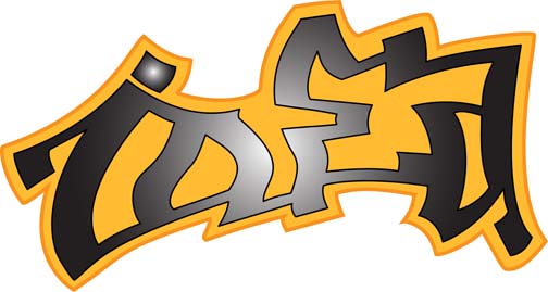
Next, we can play around with new colors, line widths, and, everyone’s favorite these days, gradients (smooth shift from one color to another). Above, you see my shiny Halloween version. Gradients can go from any color to any color but add a nice sense of depth if you choose a color and a slightly darker/lighter version of the same color.
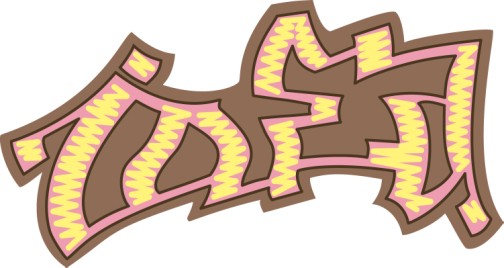
Additional designs can be added very easily in this format. In fact, anything too complicated should probably be left out when tracing with the pen and added later. In this case, I added the scribble-style fill that you can see in the original and converted it to some wacky ice-cream colors (because I have a sweet tooth)
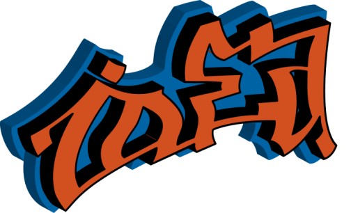
Last but not least, we can have some real fun and extrude this design to make it 3-D. This control can be found under Effect > 3-D > Extrude & Bevel. There is way too much fun to be had with using Illustrator to modify an original piece of artwork.
The vector artwork is great because it’s the best version to use for printing because it’s quality is infinite. You could take the vector file of the image above and make a vinyl wrapper for a skyscraper and the lines would be as sharp as you see them above. In fact, you’ll notice, the images above have very sharp lines to them.
These designs can be used in magazines and books very easily now. Also, since the color information is very simple, these designs are great for screenprinting (though a but more work needs to be done). As I said above, they can be used in vinyl designs for vehicles or blown up and printed as posters.
The bigger implication here is flexibility and expansion. Maybe I’m not a great graffiti artist but maybe my simple illustrations above look like a logo someone wants and I get business drawing one up. Maybe someone out there is a great graffiti artist but translates his/her work digitally and makes it known that he/she can do more than just make a piece of paper or a wall look amazing.
Expand out and learn new things; you’ll never be sorry.
< Take Action >
Comment via:
Subscribe via:
< Read More >
Tags
Newer
Aug 07, 2008
Building a homepage from a blog: Part 1: Conceptualization and Planning
When I’m complete, joshcanhelp.com will point to a home page on this blog, directing people to information about me and what I do.
Older
Jul 29, 2008
Random design inspiration post #1 - Currency
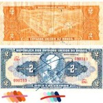
Pull a bill out and look at it really close. The detail is impressive and the layout is very interesting, particularly because it has a lot of limitations/requirements.