I’ve grown bored of my original homepage’s look and feel and I’ve been meaning to build a theme of my own for this blog so I’m combining the two projects. When I’m complete, joshcanhelp.com will point to a home page on this blog, directing people to information about me and what I do.
I’ve decided to use WordPress as my page for a few reasons:
- Constantly revolving, current information gets the attention of search engines MUCH better
- Homepage is getting zero hits monthly, this blog gets several hundred.
- I need to spend more time helping people and less time futzing with my own site
- Content management is much easier and I don’t need to think about where new stuff will go
- WordPress aesthetic is attractive
To get through this long process without driving myself crazy, I’m going to use an excellent web site design guide I found a while back. It’s called, appropriately, 12 Steps to Creating a Professional Web Design and it’s by Matt Jurmann. Though I’m new to the web design discipline, I’ve always had an organized mind and like walking through a process step-by-step rather than smashing my way through it. Matt’s article puts all the important steps in a logical order and presents it very accessibly.
So, what does Matt recommend as step 1? A three-stage design process to wring out all of those great ideas out and onto the table. And, with that, we begin…
Step 1: Design (stage 1: The Flow)
I’ve worked almost exclusively with non-designers on the web, email, and print projects I’ve been involved with and this step is always conspicuously missing. Don’t get me wrong, I’m definitely part of the problem, but two people on a mission without a concrete plan or idea of what they’re trying to communicate is a recipe for disaster.
The Pieces of the Puzzle
Let’s nail down what I’m trying to do with this project (keep in mind that I’m writing this as my brainstorming process). It’s of the utmost importance that I vocalize what needs to be accomplished and then stick to these throughout the process:
- I need, first and foremost, a digital business card. The most important reason this website exists is to get me new clients and make new connections on-line. For this reason, the fact that I’m for hire and my contact information needs to be present and somewhat prominent everywhere.
- The clients that I want/expect are not going to be greatly technologically savvy. As such, everything needs to be easy to use and easy to find. Form MUST take a back seat to function; this is not so much a creative outlet as it is a funnel for the technologically challenged.
- Because I like to write and my writing brings clicks and new people, the blog feed needs to be prominent on the site and be an integral part of the process. I want to post news, happenings, hirings, new projects, completed projects, design inspiration, and how-to guides. Anything new added to the site will likely end up being posted on my blog at the same time.
- I need a portfolio to put my completed work and anything extra that I do for myself. There are a few different types of work that I do and each one needs a bit different type of “gallery”
- I need a place for my resume. This includes experience, qualifications, mad skills, recommendations from LinkedIn, and completed projects.
- The site needs to generally match the style of my business card. Either white or off-white background with a concentration on typography and simplicity. My target audience is not designers or tech-savvy people so I want a layout that’s very easy to use and visually appealing.
Skeleton Styles
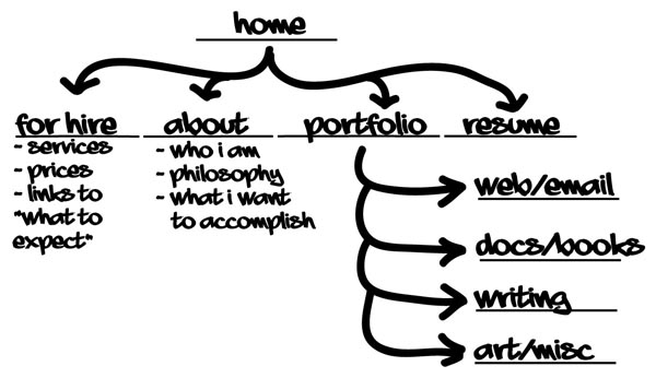
I made a quick sketch in the car during a recent trip.

Everything with an underline is it’s own page. You can see that this is going to be a nice, simple website. I don’t want a lot of pages to manage and if I need to add content, I’ll add it as a blog post and link to it. I want my concentration to be on adding posts and blogging about the work I’ve completed. I also want potential clients to be able to scroll through my work quickly and only read more about the ones that interest them (links to posts).
Thoughts on Design
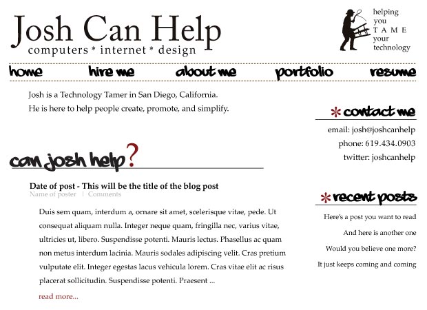
The next step is mocking up the pages and figure out how everything is going to come together. I’m not completely sure but I have a few ideas. Here’s my first draft for the layout. Comments on style and usability are always welcome.

I see a few things to change already but so far so good!
What’s Next?
- Start moving content into the blog before any design begins. I want to get the copy finished and formatted before I move forward with the theme creation.
- This is just the home page; work still needs to be completed on all the other pages, particularly the portfolio pages.
- Start looking through a few inspiration sites to add a bit more personality (light pattern in the background maybe)
- Find a blank or simple theme that I can start working with.
Next post: finished home page and portfolio designs!
Edit: I future-posted this and have completed a few of these items and taken the deign in a different direction (the one above it too “Josh” [if you know me then you know what that means]).
< Take Action >
Comment via:
Subscribe via:
< Read More >
Tags
Newer
Aug 11, 2008
Did your website or blog just crash suddenly? You might have a problem with your permissions...
Just recently, all the pages hosted on my account began to fall apart. I was getting 403 errors, missing graphics and styles, and pieces of code appearing randomly. It looked about as bad as it could get.
Older

Aug 04, 2008
Graffiti art evolution: from drawing to painting to vector; moving your art into a new market
If you paint pictures, you can design shirts. If you draw cartoons, you can easily translate that to digital images for web sites or blogs. Find the niche, spread the word, and extent your influence.