👋 I'm curently looking for a new role. Hire me!
Poor usability abound but, for some things, there are no excuses.
I’m a member at StumbleUpon and have only recently been using it on a regular basis. The idea of pressing a button and going to a totally random website is very entertaining and exciting. It’s also gathered me a nice trickle of traffic to this site.
Part of using any social networking or media tool is connecting with people you know. Meeting new people is great and a major feature of these sites but finding existing friends is important. The best way to do this is to use some kind of “add your friends” feature that noses into you email contacts and allows you to add them (or not). StumbleUpon calls this “Connect with Friends.”

There are two aspects to this seemingly innocuous function:
- Finding people who already use StumbleUpon to invite them to be a part of your network
- Inviting people who are not using StumbleUpon to join the network
There’s nothing inherently wrong with either one of these functions but they invite a social disaster. Here’s what happened to me.
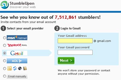
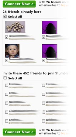
I typed in my Gmail address and password (I trust them not to store this information) and was presented with two lists: one list of people who are already part of StumbleUpon and another list of email addresses corresponding to people who aren’t on the site. Both lists are checkboxed so you can “check all” and invite everyone. The first problem is that both lists are on the same page so one button is used to both invite people who already use the site and those who don’t.

For my Gmail account, none of my email addresses were checked which means 452 are not going to get spam from me asking them to join this site. This is a good thing. Many people on here have only been contacted once or twice. So, I click Connect Now, add the existing “Stumblers” to my friend list and move on.
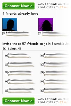
I thought “that was easy, might as well do it for my Hotmail account.” So I did and got to the same screen as above… but is it the same? Can you spot the critical difference?

Exactly, all of my addresses are now checked off. It’s 400 less people than Gmail but it’s 57 people that I don’t want to PERSONALLY send spam to. Looking over the list, there were several people that I had not talked to in a while and this is not how I wanted to reconnect with them.
So, without thinking about it, I pressed Connect Now and noticed, right after clicking, that all those addresses were checked. Not only was I tricked into inviting all these people, there wasn’t even a “Are you sure you want to send 57 emails to a bunch of people who probably won’t join this site?” pop-up box. That sucks, plain and simple.
What happened? This came from someone close to me:
Subject: I HATE THESE F*CKING THINGS… You sent me that stupid thing about “a friend wants to share his favorite sites with you” and then it sent that same thing out to all the people on my hotmail list…. That feels so f*cking invasive. It sent one to ____ and he was kinda weirded out by it because we haven’t talked for years and then this f*cking thing comes thru. If you did that don’t do that anymore – if you had someelse do that – tell them to not DO THAT.
We’re fine now but this person was tricked into the same thing. I actually found three people that signed up because the email that was sent to them made it seem like I wanted them to see something and share it with them. So they sign up, see nothing, and are then, from what I gather, are faced with the same window to invite friends. Wow! That’s really, really bad.
Did any of this HAVE to happen? No. Could I have stopped everything by watching each screen closely to make sure the pattern isn’t broken? You bet; in fact I learned an important lesson, one I should have learned long ago (though this is the first time during years of using sites like this that this kind of thing ever happened).
But, guess what? StumbleUpon now has a terrible name with three people who signed up needlessly, got irritated, and then deleted their accounts. Not only that, I was tricked into breaking a social contract (no email spam from friends) that I’m typically very good at honoring.
It doesn’t matter whether it’s a book or a software application or a brochure or a marketing piece or anything that you’re creating, there are ways to help people do the right thing and there are ways to make it harder. When you make it easy for people to do the right thing (most people, the vast majority, don’t want to spam their friends with your site), you’re showing that it is more important that you respect people than it is to reach your goals. When you trick people into helping you reach your goals (change a process mid-way, use dishonest language, don’t check with your users to make sure they know what they are doing), you’re telling me you don’t care about me and you don’t care about my relationships. At a company like StumbleUpon, a major social media and networking site, everyone should know what spam is and how to avoid it. Apparently, what they don’t know is how to help others do the same.
Bad form!
< Take Action >
Comment via:
Subscribe via:
< Read More >
Tags
Newer
May 28, 2009
What Kind of Tech User Are You?
While I was on the Pew Internet Project site, I took their “What Kind of Tech User Are You?” quiz. Not surprisingly, I got an A.
Older

May 11, 2009
The three things every business owner needs to understand about web sites
I find myself often explaining how a website works, what is needed to get one on-line, and what needs to be maintained. About half of the information I give is good to know and the other half is vital to protecting your business, your brand, and your security.